Results matching “Cascading Style Sheets” from Ye Olde Rad Blog III

Grok'ing the Ah-ha Moment

|

One of the most satisfying experiences a technoluster can have is becoming proficient with a new technology, especially one that's not easy to master. Geeks sometimes use the word » GROK, which basically means you 'get it'.

The term was coined by Robert Heinlein in his novel Stranger in a Strange Land (SciFi, 1961). The martian word implies you understand something (such as how a particular technology works) .. on an intuitive level, in a satorial kind of way.

Stranger in a Strange LandThe difference between possessing a working knowledge of a particular technology and 'grokking' it is difficult to describe. Grokking impies a deeper understanding .. that surpasses mere facts & figures.

It suggests you can 'see into' the inner workings and comprehend how the different elements interact.

I've been studying CSS (off-n-on) for months, applying the concepts I learned (.. cuz that's how I learn best). And today I finally 'got it'. It came in a flash .. known as the » ah-ha moment.

[ Hmmm. That's interesting » I was looking for a good article to link to the phrase » 'ah-ha moment,' when my Google search returned a page referencing CSS. Surprisingly coincidental, no? Seeing that I didn't query the term 'CSS' (only » 'ah-ha moment').

What are the odds of that occurring? Of those two concepts being found grouped together so prominently (link #2)? Of all the possible topics in the world, CSS comes up. Maybe it means something. ]

It's not like I didn't understand CSS before. I'd long been reading about and felt comfortable wielding the technology .. using it to whip up sophisticated layouts. But now it seems my insights were superficial .. that I was merely applying recipes, cookbook style, mechanically.

Today's insight came so dramatically that it felt like I'd swallowed a ball of CSS enlightenment. "I finally get it," I muttered. Incredibly satisfying experience. Accompanied by a feeling of arrival, completion, mastery.

Of course, this doesn't mean I know everything there is to know about CSS. Far from it. Gladwell says you need 10,000 hours to master a skill. But I now 'see' how it works .. on an intuitive level.

I would love to be able to plug a cable into my brain and upload a whole slew of other cool technologies (.. like they do in the Matrix). Unfortunately, that ain't how it works. Nor can you grok something by sheer force of will. (If we could, I'd be grunting loudly.) You 'get it' when you get it and not a moment before.

Tho I'm curious about what happens at that moment. I mean, I knew everything I did about CSS now in the moments before I 'got it'. I've also been studying Programming. Maybe that helped yield insight, cuz CSS in some ways resembles programming.

The experience, in retrospect, could be described as a 'breaking thru,' or a 'crashing thru,' or a 'falling thru,'. The thing you 'break thru' seems like a semi-translucent crystalline membrane .. that obscures your vision .. from seeing deeply .. into the inner-workings.

The distance traveled (knowledge-wise) was very small, yet the resulting effect was dramatic .. sort of like the view you get when cresting a big hill. The straw that broke the camel's crystalline back, you might say.

Enrolled in Amazon's Affiliate program, something I probably shoulda done years ago. They claim it takes ~3 days to process an application, but I received my acceptance letter today. (Applied late last night.)

Crime and Punishment

Being a n00b, I don't know much about their program yet, except that they pay a percentage whenever a visitor clicks a link on my site and makes a corresponding purchase. (How big of a percentage I'm not sure.)

I've long included links to books at the Amazon site [ in pages such as this one » Best Books for Learning the Basics of Web Site Design (XHTML & CSS), and this one » Andy Budd's Book: CSS Mastery ] without ever taking advantage of their program.

If I start making considerable cash, I'll be bummed that I didn't enroll sooner. And if I don't (earn cash), I'll be bummed too, for wasting my time with this program. So either way .. which might be why I hesitated so long.

What I like best about the Amazon program is that it allows me to monetize the site without including visible ads (.. unlike Google's AdSense program). All I need to do is add the following code to the end of each Amazon link » ?ie=UTF8&tag=radifiedcom-20. So it's virtually invisible to visitors. If I didn't tell you, you might never know.

I also like that it doesn't cost visitors anything extra when purchasing a book via a link from this site.

After establishing an 'Associate' account (and logging in to the Amazon site), a toolbar magically appears at the top of the browser window whenever I visit Amazon.com.

The Associate toolbar allows me to create targeted links to the particular book/page I'm at/on .. with a single click. Couldn't be easier. I simply paste the auto-generated code into my web page.

Reblog this post [with Zemanta]

"Hey Rad Man!" began an email I received last week. "I'll pay $100 for a link on your Downloads page." Of course, there's no way of knowing if such offers are legit .. until the cash arrives.

 BenjaminI've researched Search Engine Optimization (SEO) enough to know I don't much care for it.

Programming I enjoy, but SEO contains a seemingly endless amount of info to digest, some of which conflicts from site to site.

And the suggested techniques are often time-consuming, with dubious results that demand the patience of a saint before you start to see results. Rather focus my energies on generating original content.

Moreover, some of the techniques used to 'optimize' web pages (for higher search engine rankings) seem manipulative, if not downright dishonest. Many of the SEO sites I've visited have a 'slimy' feel to them » detailing how to trick search engines into ranking your pages higher.

I learned that links from 'ranked' pages will (in turn) yield greater 'importance' to the pages that those links aim at (point to). This is (I assume) what this person had in mind when she contacted me.

The email seemed both professional and specific. (Not slimy.) The girl was clear about what she wanted. And best of all, her proposal could be implemented minutes. (Simple.)

The problem was .. that the page they wanted a link on was created back when I knew squat about web standards (XHTML & CSS). The underlying mark-up (code) was a rat's nest of deprecated tags and coding no-no's.

Downright embarrassing .. from a webmaster's point-of-view. Miracle the page would render at all (.. even in 'quirks' mode).

Reblog this post [with Zemanta]

Changed the type of layout I use on the home page .. to » LIQUID-ELASTIC hybrid. If I did this correctly, you shouldn't notice any difference .. unless you change your default text-size (.. by selecting 'Text Size' from the 'View' menu in IE). Lemme know if you notice any display quirks.

Liquid CSS Web Design LayoutThere are 4 different 'types' of layout designs:

  1. FIXED (column widths remain fixed, no matter what, used » here)
  2. ELASTIC (column widths change with changes to your preferred font-size)
  3. LIQUID (column widths change with changes to browser-window sizing, used » here)
  4. HYBRID (combination of two or more of the above, used »  here)

I've long preferred LIQUID layouts (sometimes called » FLUID), which resize column widths as you resize your browser window (called the "viewport" by those in the biz). It's easier for me to understand the concept behind LIQUID layouts .. than ELASTIC.

Today however, I'm demo'ing a » HYBRID layout .. that combines elements of both LIQUID & ELASTIC. [ If you've read my SCSI guide, you know I'm a fan of hybrid config's. ]

The center section/column remains » LIQUID, while the two sidebars (blue-green colums) are now » ELASTIC. This means they will resize with changes made to your preferred font-size (e.g. » small, medium, large, gigantic, etc.). The center section will continue to change proportionally, as you resize your browser window - just like before.

Resizing your browser window will no longer affect the width of the blue-green sidebars (which are already skinny), while changing your default font-size will not affect the width of the center column/section.

The design itself of the home page has remained unchanged. Only the 'type' of layout has been modified (.. from LIQUID to » LIQUID-ELASTIC hybrid). This new type of page layout is considered more 'accessible' ..

.. especially for those who might have difficulty reading smaller text, and need to bump up their default font-size.

(Today btw, is 9-9-09 .. for all you numerologists.) Anybody who has ever used Cascading Style Sheets (CSS) to style a web page has likely experienced the frustration that comes when a particular style refuses to render the way you want.

Understanding the concepts outlined here will help troubleshoot any CSS rendering problem .. much better than banging your head against the wall (.. a technique that seems to provide limited success).

Three rendering principles determine how CSS styles are applied to a web page, and which style(s) take precedence. They are:

  1. The Cascade
  2. Inheritance
  3. Specificity

For reference sake, here's a quick review of basic CSS syntax » selector {property: value}

For example » p {color: green} .. will apply a value of 'green' to the color property for the text contained in a paragraph ('p' = paragraph selector). This is called a CSS "rule".

Here's a brief overview of the 3 rendering principles listed above that determine how CSS rules are applied to a web page:

CascadeI. THE CASCADE

Styles are applied in the following "cascading" order: External style sheet » Embedded styles » Inline styles.

A given HTML page can contain one, two, or all three (or none). Styles lower down the cascade normally supplement (add to) styles higher up the cascade. If a styling conflict exists however, styles lower down take precedence.

In other words, the last style applied wins (.. given equal specificity). Here's a brief description of each type of cascading style mentioned above.

1. External style sheets (fileName.css).

These styles can be applied to an unlimited number of HTML pages .. which link to the CSS file. Very powerful, since they allow you to change the look-n-feel of an entire site by modifying a single file. Web pages normally link to only a single external style sheet, tho it's possible to link to multiple external style sheets .. which also cascade, depending on the order they're listed. Large professional sites often use multiple external style sheets.

2. Embedded styles

They are found within the head tag of an HTML page. These styles are enclosed within the 'style' tag <style> and apply only to the HTML page in which they are found. These styles supercede any styles contained within an external style sheet that may conflict with them (.. given equal specificity).

3. Inline styles

Inline styles are applied to individual HTML elements/tags, using the "style" ATTRIBUTE. Note that this is not the same as the style ELEMENT applied to embedded styles mentioned above, tho it's spelled the same way. Inline styles supercede all others that conflict with them .. since the last style applied wins. Plus, they carry maximum specificity (which we'll discuss later).

Two concepts introduced early-on in the career of any aspiring programmer are » syntax & semantics. Syntax refers to the structure (or form) of code that a programming language specifies. Semantics refer to the meaning .. assigned to symbols, characters & words.

Arabic numeral threeI first became familiar with the notion of syntax while studying Cascading Style Sheets. CSS syntax employs the following form » selector {property:value}. Simple enough, no?

This form/structure allows you to style your web pages with 'rules' such as » p {color:green} .. which will change the color ('property') of text in a paragraph ('p' = selector) to (a 'value' of) » green.

While CSS might not be an official programming language, it does contain aspects that (in some ways) resemble them. And all programming languages employ syntactic rules. BTW - here's a good CSS book.

A professor once told me that the standard form (syntax) of a sentence in the English language is » Noun-Verb-Direct Object. In other words » 'Bill hit the ball.' Or, 'Mary ran up the the hill.' ( "This does that to the other." )

Most English-speaking people would agree that this format tends to work best (to convey ideas). But it is not a hard-n-fast rule. You can easily say » 'Up the hill ran Mary,' or 'Mary up the hill ran.' People might think you weird, but they'll know what you mean.

In English, we say "black beans." But the Spanish-speaking Mexicans here in Southern California put the adjective AFTER the noun » "Frijoles negros." (Can't believe frijoles negros has its own dang Wikipedia entry.) I'm chowing on a bowl of some frijoles negros & rice right now.

Programming languages (on the other hand) have little sense of humor. Break one of their structural rules and they will not only protest, but boycott your program outright. Obviously there are reasons for this strict precision. There can be no misunderstanding.

If you view this home page in Firefox (or a browser other than IE or Opera), you'll notice I added some rounded corners.

The rounded corners of this box use graphics to achieve its effect (1 in each corner). Not as cool as pure-CSS. But that's why you can see these rounded corners in IE & all browsers. This box will expand and shrink (down-n-up) as necessary to accommodate text inside, as its width is fixed (to 205 pixels).

Been reluctant to spend much time focusing on site styling, preferring rather to concentrate on generating » content.

In the world of cars, for example, I've always preferred the spartan cockpit of a Porsche to the bells & whistles you find sitting in a corvette. Tho admittedly, that's just my druthers.

My point » function should never take a back seat to form.

I've considered adding rounded corners many times before. Countless techniques exist. But they always seemed a kludge. (Andy agrees.) So I never felt it worth adding the extra markup necessary.

Techniques that use graphics to achieve their effect involve inserting additional HTML elements that are otherwise unnecessary, because current CSS standards (v2.1) allow only 1 background image per element (while each box has 4 corners). Future versions of CSS (v3.0) will support 8 images per element (for this very reason).

This approach has 2 main problems. First, adding (otherwise) unnecessary markup goes against all that is holy to the Web Standards movement, which touts the tenent of 'Semantic Markup' as one of its pillars.

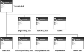
If I knew then what I know now. Ever uttered those words? Looking back on my progression of web skills, one omission stands out » incorporating the use of templates to help develop & maintain the pages of my web site.

Templates are both powerful & flexible for two reasons:

  1. They speed up site development, by allowing the rapid creation of web pages based on a preformed (uniform) structure .. so all your pages have the same look & feel.

  2. They facilitate site maintenance, by enabling structural changes site-wide via the editing of a single-file .. similar to how CSS works. This aspect of templates is considerably more significant than item #1.

Dreamweaver TemplatesIf your web site grows bigger than expected (as they usually do), and you want to make structural changes (non CSS-based changes) to your web pages, you'll have to edit each page individually (.. which suks giant goose eggs). Tedious maximus.

When CSS came along, website designers could transfer all style controls into a single file, so that the look of an entire site could be modified by editing a single file (provided, of course, the entire site was based off of the same style sheet). Very cool development.

But what about structural changes? That's where templates come in. To be honest, I'm not sure if web design programs (such as Dreamweaver and Expression) had the ability to generate templates back when I launched the site. But they do now.

After years of searching, I finally found a new template for the Rad Community forums. Named midnyte, it's (as you might expect) » dark.

YaBB = Yet another Bulletin BoardA template consists of set of files that style a bulletin board (aka 'online forum'). All templates include (among other things) a CSS file & an accompanying set of graphics.

Our old template was based on a much older version of YaBB (our forum software) .. so old, in fact, that I don't even recall which version it was based on.

I liked the way the old template looked, but it kept getting increasingly outdated with each additional update to our forum script .. thereby introducing an increasing number of compatibilty problems (which made me jump thru increasingly difficult hoops).

Actually, it was problems encountered following last week's upgrade that sent me scurrying to find a contemporary template (one based on YaBB 2.4).

Photos from Moçambique, Afrika

|

As promised, here's some photos from my South Afrikaan friend (who lives in Johannesburg). He works in the Film industry down there and loves cool technology.

Mozambique Woman

Seems like he's always traveling to one exotic place or another .. places with exotic names .. like Drakensberg (Afrikaan: Devil's Mountain) and Patagonia. (Yes, I'm jealous.)

Today's photos come from » Moçambique. (I actually had to look on a map to see where that is .. as is the case with most of the photos he sends.)

Moçambique sits on the east coast of Afrika, just above South Africa. It also shares borders with Zimbabwe, Zambia, Malawi and Tanzania. Off its coast sits the island of Madagascar.

Steve sent 5 pics, with the following note:

Just returned from a weekend escape across the border to Moçambique. Here's some pics from the capital city, Maputo, and surrounding areas.

Jo'burg sits on a high-altitude grassy plain. In comparison to most of Africa, its climate is rather harsh and frigid. Maputo, on the other hand, is further north. It sits right on the coast, and as a result is hot, humid & verdant.

Redesigned the site's » Archive index page (from scratch). It contains links to all monthly archives posted since the site's launch (summer of 2000). Gateway to Memory Lane.

Knights debating the importance of good table design with King Arthur

Been meaning to do that for some time now (years, actually). That page was the single-most mucked-up page on the entire site. The code was a rat's nest of deprecated standards, poor design choices and mark-up errors. I'm surprised it would render.

Began that page back when I knew very little about HTML and before I'd even heard of CSS. Over the years, the muck seemed to multiply as the page grew. It's not a highly trafficked page, so I didn't worry about it.

Tho at sundry times, I'd go in and try to manually clean up the code. That always proved an exercise in futility. Seemed like the more I tried, the worse things got. The only real solution was a complete makeover (a move which could be viewed as symbolic of the site's growth and development).

Now the page contains a third the mark-up it did before (10-KB vs 30) and the styling looks 3X cleaner, by making use of advanced techniques such as colgroup styling for better readability. Leaner, meaner and faster-loading.

Video Tutorial for Dreamweaver CS4

|

While recovering from the crud this weekend, I took the opportunity to work thru a video-tutorial for Dreamweaver CS4 .. consisting of ~10 hours worth of instruction and 18 chapters.

Lynda.com

So I've gotten up-to-speed on DW.CS4 .. the world's finest web design software. (This page you're reading now was created with Dreamweaver.)

Excellent tutorial. Last year, I worked thru the same title (» Essential Training) for Dreamweaver CS3, which was also good. But this one (done by different guy) was noticeably better.

I especially liked how the guy who narrates this video tutorial (for DW.CS4) spent significant time focusing on the intracacies of working with CSS.

Find recent content on the main index or look in the archives to find all content.